Guest post by Eleanor Hecks.
Images are powerful tools in your web design arsenal. They draw users in and make complex data easier to understand. Knowing when and how to use them in your projects isn’t as clear-cut, though.

Image credit: Visme (post sponsor)
Around 59% of the world’s population uses the internet. As a business owner, one of your best tools for reaching new leads is your website. Obviously, you want to stand out from competitors and create the best customer experience (CX) possible.
You likely already understand how to write an effective call to action (CTA) and lay out elements on the page. There are numerous ways to use visualizations and enhance what you already have.
Here are seven ideas for how to incorporate data through pictures, along with a few examples of sites doing it well.
1. Animate a Map
Maps are useful to illustrate specific geographic features or show saturation in various areas. However, a static map is something users might just skip past. If you animate it to show changes over time, it becomes more engaging.

The Wind Map showcases how wind moves across the United States on any given day. Animated lines show the direction and meshing of different systems. The movement grabs user attention and makes them pay closer attention to the data.
Fernanda Viegas and Martin Wattenberg lead the project. They are technology experts looking for ways to use visualization to engage users. They want to tell a story through their illustrations.
2. Tell a Story
Telling a story through your visuals is important. If you don’t have an objective in mind when creating a new illustration, it may fall flat. Think about what your target audience’s needs are and how you can solve a problem by providing digestible data.

Support small businesses. Don’t buy through “review sites” and give your money to Gartner.
Even the way you choose to lay out the facts impacts the underlying story. Should you use a bar chart, pie graph, or map?
3. Add Icons
Small visualizations create a big impact. Think about how you can enhance the data you already have on your site. Remember, people are busy. They want to scroll down the page and grab headlines and images to form an overall impression.
Adding icons, illustrations of percentages, and symbols shows the gist of the idea without the person having to read every word.
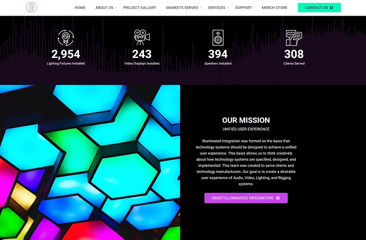
Illuminated Integration adds icons to their list of equipment installed for clients. As you scroll down their landing page, you see the numbers tick up until they hit the current number completed.
Above each animated number is an icon representing their work, such as the number of lighting fixtures installed, video displays, speakers, and how many clients they’ve served.
4. Make a Timeline
If you’re sharing the history of your company, or important turning points in an industry, you can use a visual timeline. The user follows the line, which pulls out visuals of key moments. Think of the timeline as a movie of sorts, hitting on high notes and telling its own story.
A timeline is appropriate for an About Us page and to share information on industry developments and changes.
5. Create Infographics
Large-scale infographics help break down big data and hit on the main ideas you’ve analyzed and pulled together. One advantage of creating an infographic is that others will share it, and you’ll gain exposure and backlinks to your site.
Think about the big ideas in your industry. If you sell HVAC systems, perhaps users want to know what size unit they need for their building. You could show this with images, charts, and data. An infographic typically focuses on one narrow topic and explores many facets of that subject.

Brussels Airport features a grid-like infographic to share information on this well-trafficked airport. They share information such as how many planes have been de-iced, how much concrete makes up the runways, the top five destinations from Brussels Airport, and how much beer is served each day.
Interactive infographics can also be helpful in explaining concepts and processes such as how to do on-page SEO.
6. Stream Your Graphs
It’s tempting to put everything into a grid format and line it up perfectly. Think about the way humans read a page, though. They start in the upper left corner and then move across and in a zig-zag pattern down the page.
A streamed graph somewhat aligns, but varies in height based on the information in each box. It looks more like a winding stream than boxes in a row. It is basically a stacked area graph.
7. Use Size and Color
Don’t be afraid to vary the size and color of elements in your visualizations. One of the top design trends for 2021 is asymmetrical layouts. You can create data visualizations that aren’t predictable by layering elements on top of each other, using animation, and varying the size and shade of each element.

This chart of the World’s Biggest Data Breaches and Hacks highlights the many sites falling victim to cybercrime. Note how the circles layer in on top of one another with an animation. Once they are all present, the circles appear in different sizes and colors to draw the eye where the creator wants it to go.
Make the Visualization Look Good on Mobile and Desktop
Keep in mind that more people than ever access the internet via their smartphones. Make sure any visualization you add scales down to smaller screen sizes. If you add animation, it should work just as well on mobile devices. Pay attention to the CX for your users no matter how they access your site.
 Eleanor Hecks is editor-in-chief at Designerly Magazine. She was the creative director at a prominent digital marketing agency prior to becoming a full-time freelance designer. Eleanor lives in Philadelphia with her husband and pup, Bear.